Via Cola Montano, 8
20159, Milano
Italy
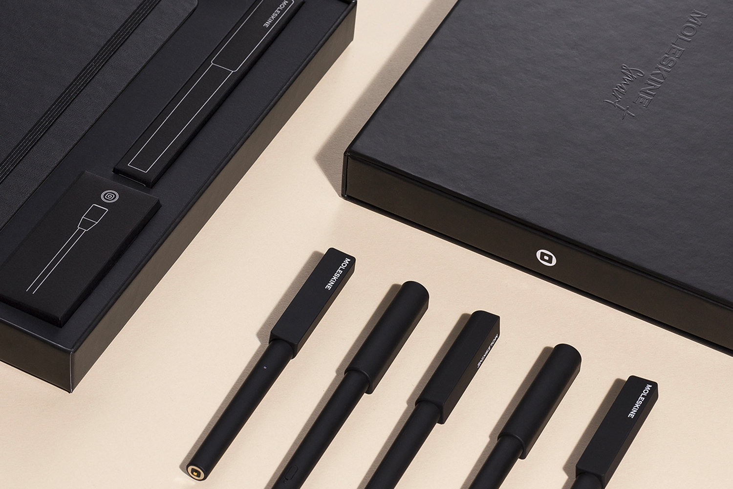
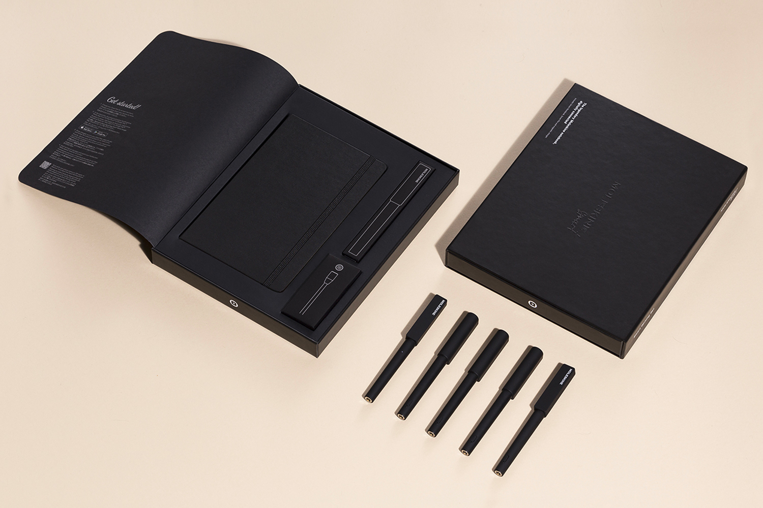
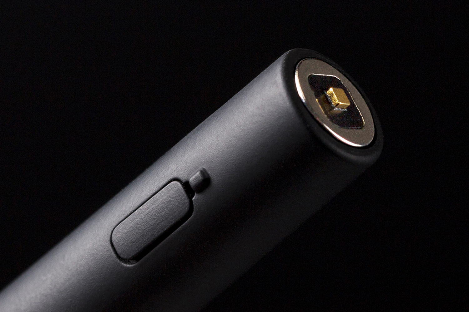
We started from the design of the new smart pen and we ended up creating the identity of the whole collection and the packaging. The formal contrast that we perceive between cap and body refers to the dialogue created by apparently opposite features such as analogic/digital, masculine/feminine, work/leisure time, creativity/rationality and past/future.
With the same approach, we designed the logo in which square and circle speak together merging each other. Finally, we designed a new precious and technologic image for packaging and we removed the plastic elements for more sustainable outcomes.
©2024 Alessandro Stabile Design Studio
Privacy Policy | Cookie Policy | Manage consent
Alessandro Stabile Design Studio SRL
Via Cola Montano 8, 20159, Milano
P.IVA / C.F. 13342720961 – REA: MI-2717215
Cap. Sociale € 10.000
pec asdesignstudio@legalmail.it
This website uses cookies to improve your experience while you navigate through the website.
View the Cookie Policy View the Personal Data Policy
YouTube is a video content visualisation service provided by Google Ireland Limited. This service allows this Website to incorporate content of this kind on its pages.
This widget is set up in a way that ensures that YouTube will not store information and cookies about Users on this Website unless they play the video.
Personal Data collected: Tracker; Universally unique identifier (UUID); Usage Data.
Place of processing: Ireland – Privacy Policy.
Google Analytics is a web analytics service provided by Google Ireland Limited ("Google"). Google uses the collected personal data to track and examine the usage of this website, compile reports on its activities, and share them with other Google services. Google may use your personal data to contextualize and personalize the ads of its advertising network. This integration of Google Analytics anonymizes your IP address.
Place of processing: Ireland - Privacy Policy
Additional consents: