


Via Cola Montano, 8
20159, Milano
Italy
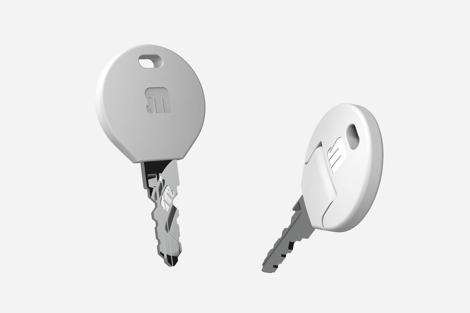
Since 2020 I have been the Art Director of Serrature Meroni, the European business leader in the production of locks and closure systems, a firm which has a traditional link with the world of design through the Nova doorknob which is part of the permanent collection of the Triennale Design Museum of Milan.
Another recurring thought was about the romantic aspect of this type of product. I wanted there to be a sense of romanticism and elegance in the design of the new products because, in the collective imagination and as a historical legacy, I think lampposts convey these feelings, whereas now they have often transformed into cold, technical elements with cooling fins and surfaces that appear to be modeled like racing cars.
Another recurring thought was about the romantic aspect of this type of product. I wanted there to be a sense of romanticism and elegance in the design of the new products because, in the collective imagination and as a historical legacy, I think lampposts convey these feelings, whereas now they have often transformed into cold, technical elements with cooling fins and surfaces that appear to be modeled like racing cars.
©2024 Alessandro Stabile Design Studio
Privacy Policy | Cookie Policy | Manage consent
Alessandro Stabile Design Studio SRL
Via Cola Montano 8, 20159, Milano
P.IVA / C.F. 13342720961 – REA: MI-2717215
Cap. Sociale € 10.000
pec asdesignstudio@legalmail.it
This website uses cookies to improve your experience while you navigate through the website.
View the Cookie Policy View the Personal Data Policy
YouTube is a video content visualisation service provided by Google Ireland Limited. This service allows this Website to incorporate content of this kind on its pages.
This widget is set up in a way that ensures that YouTube will not store information and cookies about Users on this Website unless they play the video.
Personal Data collected: Tracker; Universally unique identifier (UUID); Usage Data.
Place of processing: Ireland – Privacy Policy.
Google Analytics is a web analytics service provided by Google Ireland Limited ("Google"). Google uses the collected personal data to track and examine the usage of this website, compile reports on its activities, and share them with other Google services. Google may use your personal data to contextualize and personalize the ads of its advertising network. This integration of Google Analytics anonymizes your IP address.
Place of processing: Ireland - Privacy Policy
Additional consents: